Visualizing cultural differences between countries
Overview
A lot of research in psychology is conducted in what Henrich and colleagues (2010) have named WEIRD countries: Western, educated, industrialized, rich, and democratic. To make psychological science more ‘representative of the human population’ (Rad et al., 2018), it is important to consider cultural and psychological diversity, for example, by conducting the same study in different cultural contexts. A crucial question that follows from this is how to pick different contexts or countries. One approach could be to consult the literature or use tools that compare different countries. For instance, on https://www.hofstede-insights.com/product/compare-countries/ you can compare possible candidates on various cultural dimensions (see Hofstede, 2001). However, this approach is limited to four countries at a time and you need to know in advance which countries you are interested in.
Another approach was recently introduced by Muthukrishna and colleagues (2020). This approach compares countries with respect to various indicators (e.g. variables from the World Value Survey of cultural beliefs and behavior) and provides a quantitative measure of cultural difference. An easy way to directly obtain distance metrics of countries is to use their online tool (https://www.culturaldistance.com). Comparisons can include only some or all countries and it is possible to download the comparisons.
In my opinion, the quantification of the cultural differences between countries is a great resource that can help researchers to select study contexts (although relying on the numbers alone would probably be overly simplistic). One difficulty is that if all countries are compared simultaneously, the resulting information is very comprehensive and hard to digest. Muthurkrishna and colleagues’ (2020) article includes a figure that could solve this problem: It shows the differences of many countries relative to two reference countries. Although one still has to choose two reference countries, the visualization makes it much easier to identify countries with desired distances. However, there is currently no easy way to re-create this figure for other countries than those from the paper (USA and China).
In what follows, I briefly describe how to do this: re-create this figure with two alternative reference countries. With the code below, it should be easy for everyone to create this plot for any two countries of interest.
Re-creating the cultural distance scatterplot for any two countries of your choice
The key ingredient you need to work with the cultural differences are the country comparisons. The easiest way to get them is to visit the following website http://www.culturaldistance.com.
Choose the settings according to your preferences and download the data. (You could also download the supplementary materials and compute the differences yourself, but this takes a very, very long time; I stopped the computations on my computer after 36 hours). If you want to use different colours for different continents, you will also need to import the file with the relevant information:
Download Countries_continents.csvOnce you have the data about the cultural distances and the continents, you’re ready. Just put the code and the files in the same folder. Start by loading the relevant packages, importing the data into R, and doing some data cleaning:
# load packages
library(tidyverse)
library(ggrepel)
library(ggsci)

# import data
dat <- read.csv("download_matrix.csv")

# prepare data
# clean country names (column names)
colnames(dat) <- gsub('2005.2014','',colnames(dat))
dat <- dat %>%
  # add country names as row names
  add_column(country=colnames(dat)) %>%
  select(country,everything())

# load information about continents
continents <- read.csv("Countries_continents.csv")
# add information about continents to main data file
dat <- merge(dat, continents, by="country")
Creating the figure is simple, this is almost the same code as from the supplementary materials made available by Muthukrishna et al. (2020).
ggplot(dat, aes(x = France, y = Thailand)) +
  geom_point(aes(color = continent2), size = 2) +
  geom_text_repel(aes(label = country), alpha=0.7, size = 3) +
  theme_classic() +
  scale_color_lancet(name="Region") +
  labs(x = "Distance from France", y = "Distance from Thailand") +
  scale_y_continuous(breaks=c(0.1,0.2,0.3,0.4)) +
  scale_y_continuous(breaks=c(0.1,0.2,0.3, 0.4,0.5,0.6))

ggsave(file = "france-thailand-2d.png", height = 7.5, width = 11, units = "in")
This is the final product:
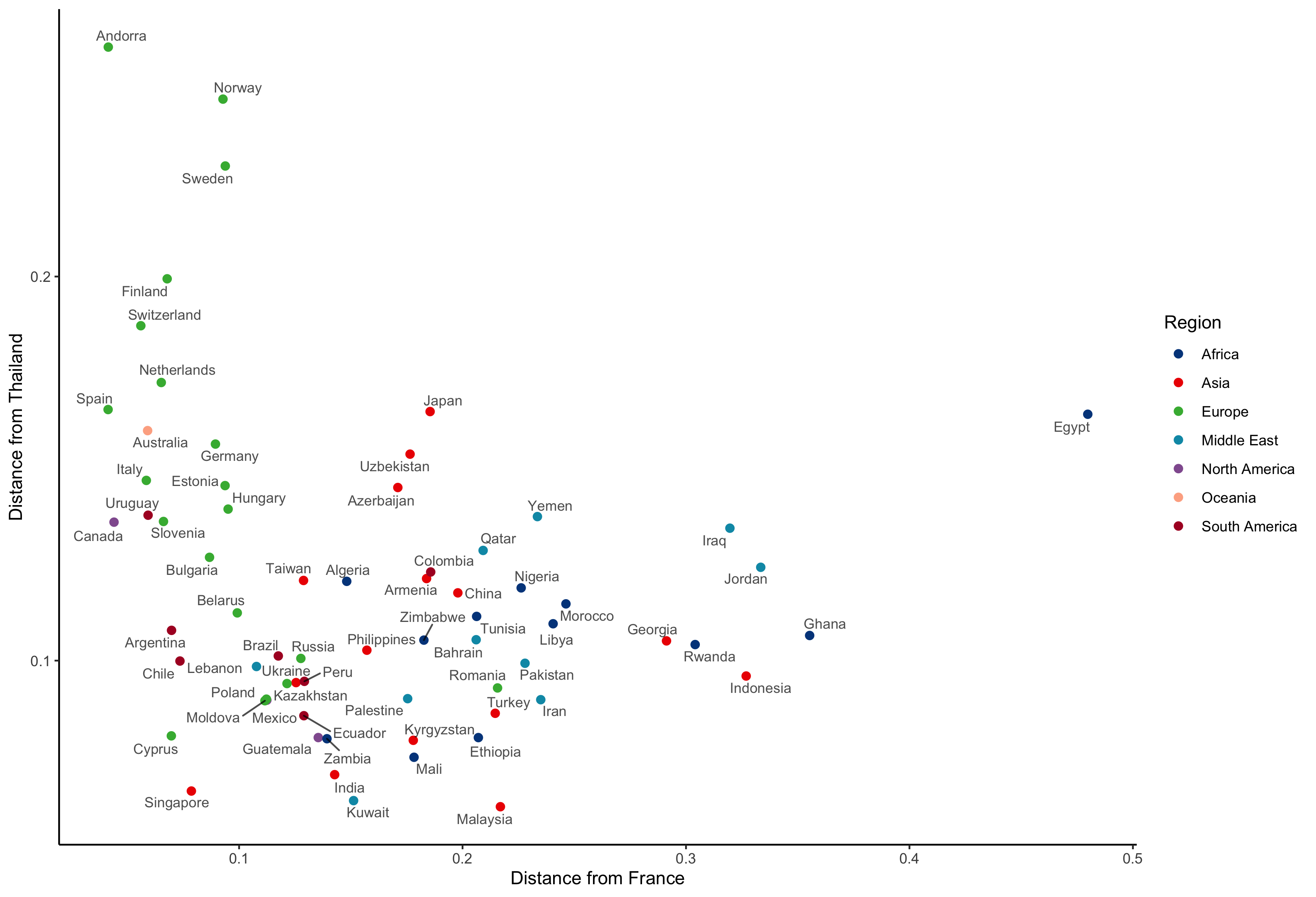
Figure 1. Scatterplot showing cultural distances from France and Thailand.
References
Henrich, J., Heine, S. J., & Norenzayan, A. (2010). The weirdest people in the world? Behavioral and Brain Sciences, 33(2–3), 61–83. https://doi.org/10.1017/S0140525X0999152X
Hofstede, G. (2001). Culture’s consequences: Comparing values, behaviors, institutions, and organizations across cultures. Sage.
Muthukrishna, M., Bell, A. V., Henrich, J., Curtin, C. M., Gedranovich, A., McInerney, J., & Thue, B. (2020). Beyond western, educated, industrial, rich, and democratic (WEIRD) psychology: Measuring and mapping scales of cultural and psychological distance. Psychological Science, 31(6), 678–701. https://doi.org/10.1177/0956797620916782
Rad, M. S., Martingano, A. J., & Ginges, J. (2018). Toward a psychology of Homo sapiens: Making psychological science more representative of the human population. Proceedings of the National Academy of Sciences, 115(45), 11401–11405. https://doi.org/10.1073/pnas.1721165115